Install the gift finder
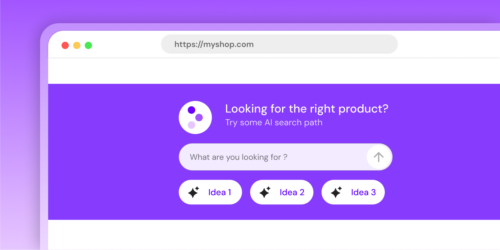
An "ask anything" block with a text input and suggested-question chips. Two visual variants: a full search section (default) and a narrow banner (banner).
Whitelist your domain first
Humind only renders on domains whitelisted in the URL whitelist page of your dashboard. Add every environment you embed on (prod, staging, preview, etc.).
Preview
Banner runs offline. Default uses shop-domain="mock" to skip the /widgets/gift-finder call.
Which install path?
| You run... | Do this |
|---|---|
| A Shopify store (online-store theme) | Use the Shopify theme blocks below. No HTML, no loader. |
| A non-Shopify storefront | Copy-paste the snippet with integration="custom". |
| A Shopify backend with a custom (headless) storefront | Copy-paste with integration="shopify" and pass shop-domain yourself. |
Shopify theme blocks
If your store uses an Online Store 2.0 theme, add the block from the theme editor — no code needed.
- AI Gift Generator → renders
variant="default"(full search section). - Shop with AI Banner → renders
variant="banner"(narrow banner).
Both blocks are available on every template (home, product, collection, page) and expose display, branding, and layout fields in the theme editor. shop-domain and integration are injected for you.
Copy-paste
Use this path for non-Shopify storefronts, or for headless setups backed by Shopify.
<script src="https://widgets.thehumind.com/v1/loader.js" defer></script>

<humind-gift-finder
  variant="default"
  shop-domain="store.example.com"
  integration="shopify"
  language="en"
  title="What are you shopping for?"
  subtitle="Our AI will help you find it."
  placeholder="I'm looking for..."
></humind-gift-finder>
Non-Shopify backends use integration="custom" and company-id instead of shop-domain:
<humind-gift-finder
  variant="default"
  company-id="<your-humind-company-id>"
  integration="custom"
  language="en"
></humind-gift-finder>
Banner variant:
<humind-gift-finder
  variant="banner"
  integration="shopify"
  title="Shop with AI"
  subtitle="Describe what you need"
  placeholder="Try: anti-frizz shampoo for curly hair"
  section-background-color="#111"
  title-subtitle-color="#fff"
  star-color="#CCADFF"
></humind-gift-finder>
Variants
variant | API call on mount | Use case |
|---|---|---|
default | GET /widgets/gift-finder | Primary search block on home, collection, or landing pages. Pulls AI-generated preset chips and theme colors from the API. |
banner | none | Narrow banner strip for global sections (header, footer, promo rows). Fully static shell — no backend. |
light | none | Filled default look with a #f3f3f3 background. Static shell, no AI chips. Good for content pages and light backgrounds where you want a CTA-like search bar without waiting on the API. |
primary | none | Filled default look painted with the merchant's primary color. Static shell, no AI chips. Good for landing and marketing pages that need a branded CTA block. |
light and primary render the search UI without calling the backend, so they don't show AI-generated questions — only the text input. Use them where a static shell is enough.
Attributes
Core
| Attribute | Type | Default | Purpose |
|---|---|---|---|
variant | 'default' | 'light' | 'primary' | 'banner' | default | Visual layout. |
shop-domain | string | - | Required for default. Pass "mock" for an offline demo. |
company-id | string | - | Alternative to shop-domain. |
integration | 'shopify' | 'woocommerce' | 'custom' | 'playground' | shopify | Backend platform. Use custom when the storefront is not Shopify/WooCommerce. |
language | string | - | ISO 639-1 code. Also localizes the placeholder default when that attribute is left blank. Supported: en, fr, de, es, ar, it, nl, pt, ru, zh. |
api-url | string | https://api.thehumind.com | Override API base URL. |
Display
| Attribute | Type | Default | Purpose |
|---|---|---|---|
title | string | '' | Headline. Merchant-branded; not auto-localized. |
subtitle | string | '' | Sub-headline. Merchant-branded; not auto-localized. |
placeholder | string | What can I help you find? (en) | Input placeholder. Leave blank to get the auto-localized version for language. |
show-questions | boolean attr | true | Show preset chips (default variant only). |
Colors: default variant
| Attribute | Type | Default |
|---|---|---|
color-scheme | 'default' | 'custom' | default |
primary-color | string (hex) | - |
text-color | '#000' | '#fff' | #fff |
title-subtitle-color | string (hex) | #fff |
button-design | 'filled' | 'outlined' | filled |
color-scheme="default" pulls colors from the API. color-scheme="custom" requires primary-color.
Colors: banner variant
| Attribute | Type | Default |
|---|---|---|
section-background-color | string (hex) | #222 |
title-subtitle-color | string (hex) | #fff |
star-color | string (hex) | #CCADFF |
The banner variant ignores primary-color, text-color, color-scheme, button-design, show-questions.
Theming notes
text-coloris a contrast toggle. Use#000or#fffonly.button-design(default variant only):filled: chip background = primary color at 10–20% opacity. Text =text-color.outlined: chip background transparent. Border + text = primary color.
- The widget uses a generic sans-serif stack (
Arial, Helvetica, sans-serif) inside its Shadow DOM. Host fonts don't carry over. Ask support if you need a custom typography pass. - Sizing, spacing, and border-radius are not themable.
Events
Fires humind-open-chat on window when the user submits the input or clicks a preset chip. The chat overlay (if installed) catches it and opens with the user's query.
window.addEventListener('humind-open-chat', (e) => {
  console.log(e.detail.message); // string the user submitted
});
Mock mode
Pass shop-domain="mock" (or company-id="mock") to skip the /widgets/gift-finder call and render a hard-coded sample. Useful for local previews, Storybook, or demos before the merchant account is live. All attributes remain reactive in this mode.